
Prerequisites:
- Your site’s theme must be set to “A UW Madison Theme.”
- You must be editing a Page, not a Post.
- You must be comfortable visualizing and sketching out a page layout before you build it. Basic design experience is helpful.
Overview
The standard WordPress Editor lets you create content in a single column – the content area.
Most of the time, the Editor will meet your content-building needs.
For your homepage, however, you might want to build a page with a more sophisticated look, e.g. multiple columns or special content.
♠ ACE allows you to:
- arrange content in rows that will resize properly for mobile devices
- adjust the space above and below the row
- vary the number of columns – 1, 2 or 3
- vary the width of the columns
- add a background to the row – a solid color or an image
- add one of two styles to the columns (for the 2- and 3-column layouts)
- add a prebuilt type of content to the column:
- a title block
- a body text block
- a button
- an accordian panel
- images linked to featured pages and posts
- person feature
- content pulled in from another WordPress site
- link to social media accounts – Twitter, Facebook, and Instagram
- fundraising
- directory listing
You build the page one row at a time, adding content across the columns left to right.
Step-by-Step
- On paper, sketch out a layout for your page content – the number of rows and the number of columns within each row. Consider what type of content you want to display in each block – see item 7 below for choices.
- Edit a page, or create a new page.
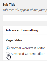
- In the Advanced Formatting block (below the Sub Title field), under Page Editor, choose Advanced Content Editor:
A new box appears – Page Content Options.
Tip – Working with Blocks
♠ ACE works with blocks to represent rows and content.
| To collapse or expand a block: | In the upper right corner, click the triangle icon (last icon). | 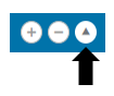 |
| To delete a block: | In the upper right corner, click the – icon (middle icon). |  |
| To add a new block: | Click the Add button at the bottom of the block, or in the upper right corner, click the + icon (left icon). | 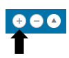 |
| To move blocks: | Collapse the block you want to move, and the blocks around it. Click and drag the block you want to move. The cursor changes to a four-headed arrow. Drop the block in the new location.
|

The blocks are nested – the content blocks are nested inside the row blocks, and you can tell the areas by the gray borders:
Try to keep the blocks collapsed when you are not editing them or content nested within them.
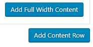
- Click Add Content Row. A popup menu appears allowing you to choose the number of columns in the row – full width (1), two columns, three columns.
- Choose the number of columns. The Page Content Options box changes to show new fields based on the number of columns.
- Set the row properties.
For a Full Width Row:
- Row Width Limit – if desired, set the maximum width of the row
- Row Spacing Top and Row Spacing Bottom – if desired, adjust the space (padding) around the row
- Row Background – choose no background, a solid color background, or an image
For a Two-Column Row:
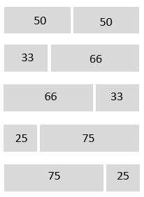
Column Sizes – choose the column sizes (listed in percentages):
- Row Spacing Top and Row Spacing Bottom – if desired, adjust the space (padding) around the row
- Row Background – if desired, choose no background, a solid color background, or an image
- Column style – if desired, choose a column style – Default or Red Background
For a Three-Column Row:
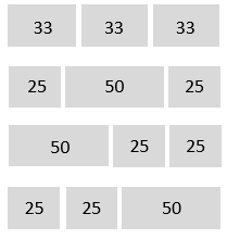
Column Sizes – choose the column sizes (listed in percentages):
- Row Spacing Top and Row Spacing Bottom – if desired, adjust the space (padding) around the row
- Row Background – if desired, choose no background, a solid color background, or an image
- Column style – if desired, choose a column style – Default or Red Background
- Add the content.
Content Options:
Available for all column layouts:
| Title Text | Adds a single line of text – no formatting. |
| Body Text | Adds multiple lines of text, with formatting, but no images. |
| Button | Adds a blue button that links to a page or post. |
| Events | Adds a block that retrieves and displays events from a specified WordPress website. You set the website and the number of events to display. |
| Photo | Adds a single photo, no caption. |
| Highlighted Post/Page | Adds a single image linked to a page or post. The image is either the featured image for the page or post, or another photo you specify via Override Image. |
| Remote WordPress Content | Adds a block that retrieves and displays remote content (e.g. news items) from another WordPress site. You set the website, the number of items to display, and the source categories.
|
Available only in the full-width column layout:
| Accordian Panel | Adds expanding/collapsing content – great for question and answer pages to display the questions with the answers collapsed. |
| Person Feature | Adds a box containing a mini bio – you enter a Section Title, the Person’s Name, the person’s Bio, choose or upload a photo, and add a Quote. |
| Social | Adds a box for the following social media accounts: Facebook, Instagram, or Twitter. Manual lets you display an image and a description, with icons and follow links; automatic pulls a live feed in from your account. |
| Fundraising | Used for specific fundraising events, you must specify the Campaign name and Campaign URL. |
| Directory Listing | Works in conjunction with the Directory data type listed on the WordPress Admin Dashboard menu. Once you have created Directory entries, you use this content type to add a box to display the directory. Listing Options include displaying entire directory, specific groups or individuals, or sort by groups. Depending on the Listing Option, you may be able to allow filtering and/or hide profile photos.
You can find directions on how to create a directory listing here. |
Tip – Widening Your WordPress Display
Normally the WordPress admin content editing screens display two columns – the content on the left, and the Publish and other blocks at the right. When working with 2- and 3-column rows in the Advanced Content Editor, you may want to switch the screen display to a single column.
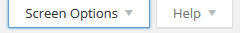
- In the upper-right corner of the screen, locate and click the Screen Options tab:
- The tab expands downward to display additional blocks:
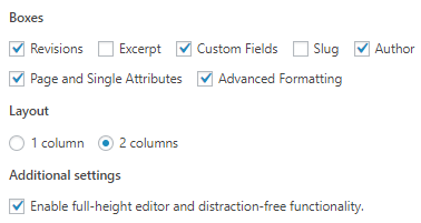
- In the Layout section, click 1 column.
- Click the Screen Options tab again to close the tab and save the changes.
- Publish the page.
- Preview the page and make changes as desired.
- If desired, add additional rows and content.