
Tip: if you are looking for information on a particular setting, try using your browser’s search feature (Control + s on Windows, or Command + f on the Mac).
Page Index – click the link to jump down to a particular section:
Opening the Customizer
Login to your site.
- On the WordPress Admin Dashboard (the black vertical menu at the left), locate and click Appearance..Customize. The theme Customizer appears, with the Customizer options on the left, and a working display of the homepage on the right so you can see the changes as you make them:
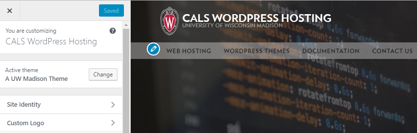
- Clicking each entry on the left opens a subpanel with more options:
Options
Site Identity
- Site Title
The name of the site. Appears to the right of the UW shield logo. - Tagline
Not displayed in this theme - Campus Title
The text that appears above or below the site title in all caps. - Campus Title Link
Optional – you can make the this text link to another page on or off the current site. - Crest Style (UW shield logo):
| Monochrome |  |
| Color |  |
| Hybrid |  |
- Site icon
This is the tiny icon that appears in the upper-left corner of a browser tab or as an app icon on your mobile device. By default, the site icon is set to a red “W.” The image for the site icon should be square, and no smaller than 512 pixels x 512 pixels.
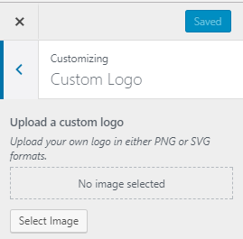
Custom Logo
- Upload a custom logo
- Replaces the UW crest logo
- Acceptable file types – PNG or SVG
- PNG – maximum dimensions – 250px wide x 80px high
- SVG – maximum dimensions – not applicable (file type scales up and down without loss of resolution)
- Upload an alternate logo
- Allows upload of an alternate logo (PNG or SVG, dimension limits above apply) to cover situations where you need more contrast. Example: if the existing logo looks great against a white background, it may not have enough contrast against a black background if someone customizes the colors. You can choose to upload an alternate logo with the colors inverted, or the Customizer will attempt to invert the colors for you.
- Homepage logo position
Top left (default), or center left of the hero image (a.k.a. the big image or slideshow at the top of the page)
Colors
- Background color
Changes the background color of the page in the band below the bottom of the hero image and above the footer.- The default color is #f7f7f7 in case you need to change it back.
Note: the background color change will take effect on the site, but the change does not initially appear in the Customizer when you make the change. To see the effect in the Customizer, click the Refresh button on your browser.
Fonts
This allows you to choose between Verlag, the font used on the main UW Madison website (wisc.edu), and Raleway/Open Sans.
- Verlag has a more distinctive appearance, and the headings are very bold on the page. It is a little larger than the same size text set in Raleway/Open Sans. This means text set in Verlag will run a bit longer on the page.
- Raleway/Open Sans is a lighter, more rounded font than Verlag. The text will appear a little more gray on the page than Verlag.
Navigation Options
- Hide Main Navigation
Turns off the main menu; use on one-page sites. - Navigation Font Size
Normal (default), or Large
Note: if you have a long menu, enlarging the font could exceeding the menu width; the menu will disappear and be replaced with the three-vertical-bar menu icon:

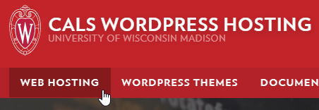
- Navigation Bar Style
Opaque Navigation Bar – turns the menu red, and the area above the menu a lighter red:
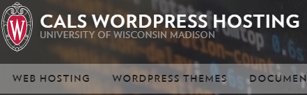
- Transparent Navigation Bar
Only works over a photo or video – makes a “ghost” (lightened version) of the photo or video behind it:
(nope, doesn’t work – Transparent Navigation Bar – on a solid color background – turns the menu background the same color as the background)
- Drop-down Menus
Enables the first-level child menus on the horizontal menu, known as the Primary Menu. The second menu in this theme is the Resource menu, in the upper right corner next to the search icon. The Resource menu is not affected by changing this setting. - Navigation Layout
Changes the location of the Primary Menu – either above the UW crest, or below it.
Hero Image Options
The hero image displays header slides you create using the Header Slide option on the Admin Dashboard Header Slides. The slides can contain an image or video, latest posts, a specific post, site search, or remote content pulled in from another WordPress website. For more information on creating Header Slides, see these instructions.
- Shown/Hidden
Toggles the Hero Image/slideshow on or off. - Use a cross dissolve effect for Header Slide transitions
Adds an animation effect when the slides change. - Frosted Glass Effect on Homepage
Takes the hero image and reflects it below the main menu, blurring it.
Note: this only applies to photo slides, not videos. - Frosted Glass Effect on Subpages
Takes the hero image and reflects it below the main menu, blurring it
Note: this only applies to photo slides, not videos. - Hide Header Slides Dots, Arrows
Controls the slide navigation options. By default, the Header Slides display centered dots below the slide and arrows at the far left and right of the slide. - Hero Image Size on Homepage
Changes the space between the slide title and the top of the page content – does NOT change the size or placement of the hero image. You can use this command to reduce extra white space below the slide. - Hero Image Size on Subpages
insert description here
Page Options
- Page Breadcrumbs
This turns off/on the page path with links at the top of page:

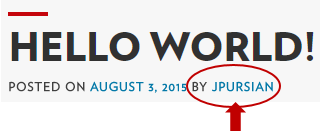
- Posted by Location
This only applies to Posts (a.k.a. articles) – it moves the name/username of the person who published the post to before or after the article:
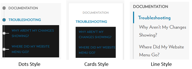
- Sidebar Style
Toggles the styling of the sidebar between dots, card, and line:
- Mobile Responsive Tables (ask Al)
- Tablesaw
- Data Tables
- Sidebar Navigation Style
This only applies when the page is tied to other pages with a parent/child relationship in the Page Attributes box.- Simple Navigation
Shows the position of the current page at the top of the navigation tree, and displays links to any child pages:

- Expanded Navigation
Shows the position of the current page and all the page’s siblings at the same level, with links to any child pages:
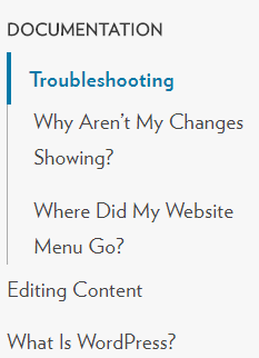
In the example above, the current page is documentation, Editing Content and What is WordPress are sibling pages at the same level, and Why Aren’t My Changes Showing? and Where Did My Website Menu Go? are child pages of Documentation.
- Simple Navigation
Social
Adds social media icons to the lower right corner of the footer, shown on all pages of the site:
As you enter the social media ID in the fields, an icon appears in the lower right corner of the footer, linked to that account.
Social media account choices include:
- Flickr
- YouTube
Addition ways to link to your social media account:
- The Cals WP Twitterfetcher Widget plugin allows you to add a widget (box) in the sidebar that displays your most recent Tweets.
- The Advanced Content Editor allows you to add a fancier block to the content area of your page with social media links. Click here to learn more about the Advanced Content Editor.
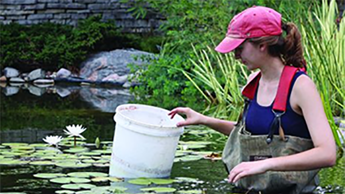
Background Image
Adds a background image (the same one) to every page on the website.
Consider these points before adding a background image to your site:
- Adding a background image may be visually “busy” and may distract visitor’s attention away from your content.
- It may also cause your webpage to load slowly, particularly over slow connections, like mobile.
- Screens vary from a tiny phone screen to huge desktop monitors. You can downsize a big photo to fit a small screen, but you can’t upsize a photo to fit a bigger one – it will just make the dots (pixels) larger and make the photo blurry. You are stuck with whatever size the original photo was captured at.
Example:
Look at the edges of the water lilies and the water surrounding them.
Watch what happens to those edges and the water when we enlarge that photo by 200%:
- Preset
Fill screen, Fit to screen, Repeat, Custom - Image Position
Allows you to position the background image in the browser window. - Image Size
Original, Fit to Screen, Fill Screen - Scroll with Page
Normally, everything layered on the page is tied together, and everything moves together when you scroll the page up or down. Turning off this setting means the background image will remain in place, while the content layers scroll over it.
Analytics
Analytics monitors your site traffic, and breaks it down into statistics like number of site visitors, which pages they visited, at what time, where the visitor was from, and what type of technology they used to access the site.
These types of statistics are useful for faculty annual activity reports, reports to funding agencies, grant proposals, and faculty tenure packages.
Two free analytics programs are Google Analytics and Facebook Pixel Analytics. You must first create an account and get a tracking ID, then you add the tracking ID to the fields in this section of the customizer.
For more information on setting up analytics for your site, email websupport@cals.wisc.edu.
Search
WordPress has a built-in site search. However, if your site contains a number of files such as Word or PDF files, and you want people to be able to search for terms contained inside these files, you may want a more powerful search for your site.
In the past, we have used Google CSE for this purpose. Unfortunately, Google is in the process of phasing that product out. We are currently searching for a replacement product.
Menus
This theme allows two menus:
- the main horizontal menu, which is located near the top of the page or post
- a resource menu, located in the upper right of the page or post
Main menu:
- supports a single level of child entries*
- by default, the theme does not display child entries – you must enable them in Customizer..Navigation Options..Drop-down Menus
- the single level limit makes the menus easier to navigate on mobile devices
- if there are too many entries on the menu, or the individual labels are too long, the main menu will collapse to a three-vertical bar icon
* child menu entries are the drop-down list entries that appear offset to the main “parent” menu entry when you hover your cursor over the entry, or click the entry.
Resources menu:
- appears collapsed by default; when you click the menu, a popup appears with the menu items
- does not support child entries
This section of the Customizer shows what menu files are assigned to the main and resource locations.
The Customizer provides little context for working with the menus; you may want to read this page to learn how to work with the full menu editor (Appearance..Menus). The full menu editor allows you to create menu files, add content to them, and then assign them to either the main or resource menu locations.
Widgets
This theme has multiple locations to place widgets:
- for posts – five locations – four 25% width boxes in the footer, and one area in the sidebar
- for pages – five locations – four 25% width boxes in the footer, and one area in the sidebar
Widgets placed in the footer always display; widgets placed in a sidebar only display when you enable their display – edit the page or post, and in the Page Options box, click Show Page Sidebar Widgets.
Tips:
- By default, when you place a widget in the Posts or Pages widget area, it will display on all the Posts or Pages in the entire site. It is possible to have individual pages display different widgets, but it requires planning, a special plugin and the help of the Web Support team. Consider it carefully, because displaying different widgets can confuse the users.
- If you are troubleshooting why a widget won’t display in the sidebar on a page, double-check that the widget is in the pages widget area, not the posts widget area. The posts widget area is at the top, and the pages area is down below the footer widget areas.
- The display of the widget areas in the Customizer is context-sensitive – it will change based on the content (page or post) in the right area of the Customizer. If the widget area does not have any content, it may not show up in the left area of the Customizer.
- By default, the posts widget area contains a bunch of widgets – Search, Recent Posts, Recent Comments, Archives, Categories, and Meta. You won’t realize that the default widgets are there until you create a post and turn on the sidebar. It’s a good idea to clean out the posts widget area by dragging the widgets left off the widget area.
The full widget editor (Appearance..Widgets) shows you all available widgets, and lets you add, configure, and remove them from the widget areas.
Static Front Page
By default, WordPress displays your latest posts on the homepage.
This section of the Customizer lets you change that setting, and display either a regular page, or a “post” page consisting of all the posts for a given category.
Additional CSS
If you understand HTML and CSS, you can use this section to add CSS to override the theme’s stylesheet.